Responsive Web Design Intensive
A six-month structured program starting September 2025. Learn to build adaptive interfaces that work across devices, master CSS Grid and Flexbox, and develop real-world projects with guidance from experienced professionals who've shipped products for Taiwan's tech sector.

Eldwin Thorvaldsen
Lead Instructor & UX Engineer
I've been building web interfaces since 2012. Started with table layouts (yeah, those days), moved through the jQuery era, and now I spend most of my time working with modern CSS and progressive enhancement strategies.
What I like about teaching is showing people how responsive design isn't just about breakpoints. It's about understanding how content flows, how users actually interact with different devices, and why a mobile-first approach saves you headaches later.
I work with several startups in Taipei and Taichung, helping them build interfaces that don't break when viewed on older phones or when someone zooms to 200%. That real-world experience shapes how I teach—practical problems, practical solutions.
The program changed how I think about building websites. Before, I'd design for desktop and then struggle with mobile. Now I start with content structure and let it adapt naturally. That shift in mindset made everything click.

What You'll Actually Learn
Fluid Typography & Spacing Systems
Stop guessing font sizes at different breakpoints. We'll cover clamp(), viewport units, and custom properties to create text that scales proportionally. You'll build a reusable spacing system that keeps your layouts consistent without writing dozens of media queries.
CSS Grid & Flexbox Patterns
Learn when to use Grid versus Flexbox and why it matters. We'll build common layouts—sidebars, card grids, headers—and handle the tricky edge cases like uneven content lengths and dynamic item counts. Plus techniques for making grids work on narrow screens without horizontal scroll.
Performance & Loading Strategies
Responsive images with srcset and picture elements. Lazy loading that doesn't break layout. Critical CSS extraction. We'll measure actual performance on mid-range Android devices because that's what many users in Taiwan actually use.
Accessibility Across Devices
Touch targets, screen reader navigation, keyboard focus management. Responsive design includes making your interface usable for people with motor difficulties or visual impairments. We'll test with actual assistive technology and fix common issues.
Real Project Development
You'll build three projects during the program: a content-heavy blog, an e-commerce product page, and a dashboard interface. Each one presents different responsive challenges. You'll get code reviews and iterate based on feedback, like actual development work.
Program Structure & Schedule
Classes run twice weekly from September through February 2026. Tuesday and Thursday evenings, 7-9 PM Taiwan time. We keep groups small—maximum 12 students—so everyone gets direct feedback.
Between sessions, you'll work on assignments. These aren't busy work. Each one builds on previous concepts and prepares you for the next class. Expect to spend 6-8 hours per week outside of class time.
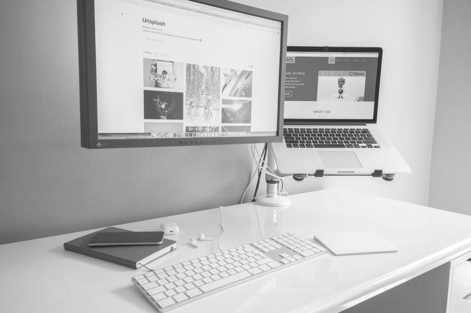
You'll need a laptop and a code editor. We'll provide access to browser testing tools and a private repository for your work. Everything's online, but you're welcome to join from our Nantou office if you're local.
Get Program Details